Better B&W Portraits in Photoshop: Sliders, Channels and More (Premium)
One of the blessings of digital photography is that you can fine-tune the tonality of black-and-white images to a degree unheard of in the days of film. This is especially helpful when shooting portraits. Of course, you have to start with a color image. And a RAW file format gives you more options and flexibility than JPEG.
The Film method
To understand how to use color sliders and channels to achieve the results you want, let’s first review how to shoot a portrait on film. You start with lighting that is soft enough to give the skin a nice glow. You then can lighten the skin by using an orange filter. This further brightens the skin tones.
Once you processed the film, you then printed, again using dodging and burning tools to get the exposure just right, and possibly introducing a little vignetting around the edges, if that was your style.
Digital: You’ve Got Options
By comparison to film, with its fixed-intensity filter system, digital explodes with creative options, although you have different tools, depending on whether you’re working on a RAW or a JPEG file.
When working with RAW files — you can either open the image in Photoshop’s Camera RAW tool, or in Lightroom, which lets you work on large numbers of images in a relatively short time. You also have the equivalent of dodging and burning tools that let you select areas of the image to apply grayscale mix sliders (as well as other settings) without affecting the rest of the image.
Let’s take a look at these tools and how you can really fine-tune your portrait quality with them, using a couple of examples.
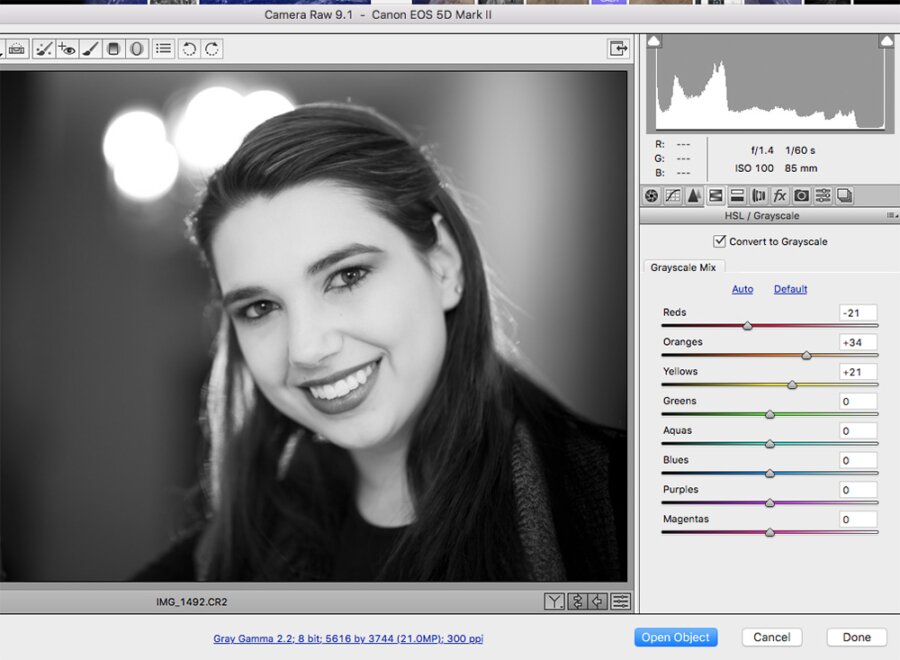
First, let’s look at the workspace.

This is the first thing I saw when I converted the color original RAW image to Black and White. To get here. I selected the HSL/Grayscale dialog box, below the histogram on the right side of the screen. I checked the “Convert to Grayscale” box, and the image switched to black and white; the eight Grayscale Mix color sliders appeared. The sliders had already been shifted automatically, which Ironically is called the Default setting. I clicked on Auto and everything went to zero.
After that, I simply slid each slider back and forth and watched the effect each had on the image. The greens, Aquas, Blues, Purples and Magentas had no significant effect. This makes sense, since these colors are insignificant in this image.

Backtrack: Here’s our color original, of model Leanne, shot with one of those cool 85mm f/1.2 super narrow depth-of-field lenses. Note that the image has a strong orange cast, but is, in fact, balanced for accurate skin tone. Also, note that red, red lipstick. This will come into play later.

Let’s take another look at the “flat” black-and-white original. The skintones are good, although the lips don’t stand out as much. Also, I wanted to go for a more etherial, porcelain complexion. So, I played with sliders…

Oops! By moving the red slider to +50, I made her lips disappear! This little disaster may not be great for lips, but if your subject has zits, sliding the red to the right could actually help their skin condition.

Moved the red slider left, to -25. That helped Leanne’s lips stand out more. But I wanted an even more dramatic contrast.

To give Leanne’s skin a lighter look without affecting her dramatically dark lips, I pushed the orange filter to +25. More than that would have been too much, but this gave me the effect I was looking for.

One more fix: Reducing the orange in the image rendered the background a little less dramatically, so for one final fix, I applied graduated filters on both right and left sides of the image, and reduced the exposure by 2.25 stops to subtly guide the viewer’s eye towards Leanne’s face.

Here’s what my workspace looked like with the graduated filters in place. The Graduated Filter icon is the fifth box in from the right above the photo. Alternatively, you can use the selection or brush tools to select more specific areas of the photo to apply changes…and this includes color sliders.

Too much orange: Just for fun…Here’s what happened when I moved the orange slider in the wrong direction: blocked shadows and blotchy skin, the opposite of what I needed. But hey, it’s a look.
Two JPEG Methods
While the above example is with a RAW image, you can also apply these effects to JPEG images in Lightroom, although your range will be more limited. But if you open the image in Lightroom, the process is a bit different.

One method is to use Adjustments > Black & White (see the workspace, above). The Black & White pulldown menu option brings up the following:

The Black & White menu brings up a slightly smaller menu of sliders (above) than you’ll find when working with RAW files. Notably missing is an orange filter, which could cramp your style. But try out the different sliders and see how they affect skintones.

A second, easier method is the Adjustments > Channel Mixer. This brings up a dialog box showing red, green and blue channels. Click the Monochrome box at the bottom, and then pull down the presets; for portraits, you are likely going to want to choose the Black & White With Orange Filter (RGB) setting, although in this case the Red Filter option gives you a more glowing look.
Neither of the JPEG options gives you the level of control you have with RAW, but they may be enough for you. The best way to find out which tools work best for you is to to get your hands dirty. Try them all and compare the results as well as the amount of time you needed to get to where you wanted to be. You may also stumble upon a look that speaks to your artistic vision. Experiment and enjoy the process.