Editing a Black and White Photo in Adobe Lightroom
If you like content like this, please considering . It’s as little as $10/year, but if you give a bit more you can get cool rewards and more.
Back in the film days, fixing a photo usually was as simple as involving burning and dodging specific areas. For the most part, that’s still what many photographers do. But it can get more involved with digital photography. Converting an image to black and white brings it back to its simple nature and gives the photographer the ability to really fine tune an image to look just the way that they want it to.
And trust me, it’s much easier than you’d think.
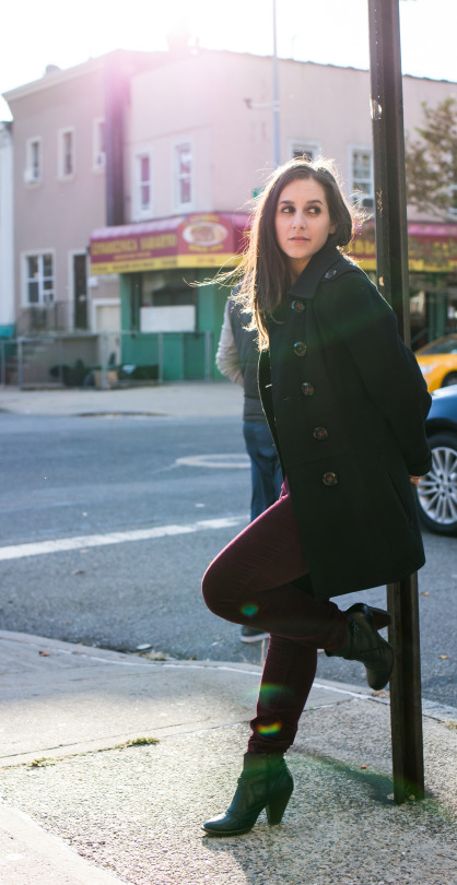
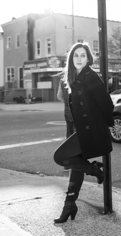
The above photo is pretty much what the original image looked like. I’ve cropped it to be the way that I’d prefer the final to look. As you can see, it’s already pretty good and effectively make use of a simple color palette.
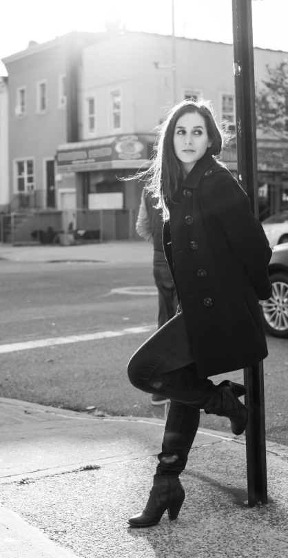
As a straight conversion to black and white, here’s what that same photo looks like. Still pretty nice; but a bit more oomph can be given to make it really pop.
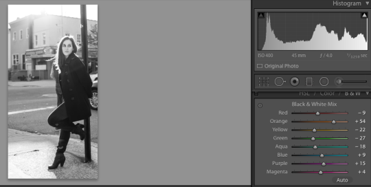
You’d think that most of that work needs to be done in the basic adjustments panel of Adobe Lightroom, but you’d be very wrong. Instead you should save those for last and work with the color channels specifically. Samantha’s skin is associated with the orange color channel for example but adjusting the other colors gives really fun and cool effects.
What this in turn does is adds image noise. The noise is easily eliminated using the noise reduction settings in Lightroom. Of course, you can also always add more grain if you’d like.
Doing all of this is a cool trick that not a enough photographers experiment with: but it has to do with the fact that black and white photos become all about lights, darks, contrast, blacks, whites, and clarity.
Here’s another example and this time we’re going to go through the editing and reasoning a bit more:
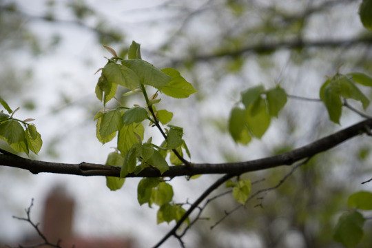
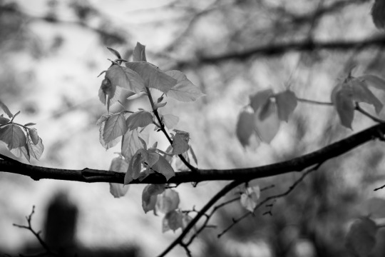
This image of typical leaves. Let’s identify a couple of important things here:
– The bottom left building is pretty much orange
– The leaves have tones of green and yellow in them.
– A bit of the blue sky is coming through
– The black branches/stems act as leading lines.
Cool, now we’ve got something to work with.
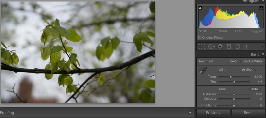
To make it a better black and white photo, you’re first going to start with a straight black and white conversion. So go ahead and click the photo in the top right.
See the basic adjustments? Leave them alone for now. Most photographers head straight to these, mess around with them, and pray that something cool comes out. Don’t do that. We’re going to use logic and reasoning here.
With the straight black and white convert what you see is that the leaves are dark. Why? Well, come to think of it, the leaves were dark to begin with. In fact, after the branches they were probably the darkest part of the scene, right? So before you edit you need to figure out the following:
– What colors were primary to this image?
– Which colors were the darkest?
– Which where the lightest?
– How contrasty was the photo?
– How were the mid-tones?
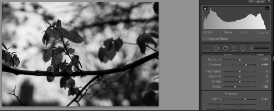
After this, you’ll need to adjust accordingly. So that means that you’ll be raising the exposure of the greens and adjusting the other colors accordingly to how you’d like the image to look. Here’s what I did though:
I brightened the greens and yellows because the leaves were associated with those colors. I also turned down the orange to make the out of focus building add a bit more shape to the scene. I chose not to adjust the blue because it provides enough of a fair canvas–so to speak.
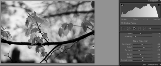
After this I adjusted the sharpness, killed the noise I created by editing the colors, and did a contrast boost on top of a clarity boost. The contrast made all the details stand out even more in the scene.
And that’s how you create a better black and white image using reasoning. We hope to see yours sent to us in a reader’s mail!
As always, if you want to see more content like this,