Processing Dark and Moody Black and White Portraiture (Premium)
Processing dark and moody portraits starts with how you shoot the images. If you do not start with a file that has been shot with an eye to process it this way than you may run into trouble. So if you happened to miss it, please make sure and take a look at part one of this series so that you understand how to get your images to a point where these processing steps will work as intended and make sense.
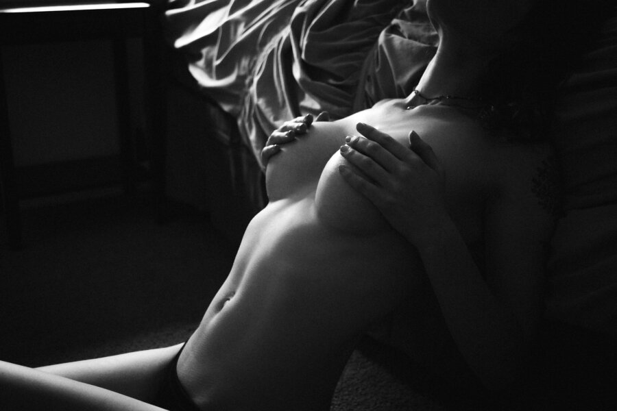
To begin, dark and moody portraits, at least in the sense that we are talking about here, are designed for the highlights to draw your attention to the subject in a specific way. Be that the curves, wrinkles, eyes, whatever piece of your subject you want to highlight.

In the case of this boudoir client, we were trying to highlight her shape and draw attention to her breasts in a classy way, and as you can see, on its own the image is rather bland. The first step in this process is to get your highlights and overall exposure figured out. To do this, grab your exposure slider in Lightroom and drag it to the left making your image darker. Do this until your highlights are just slightly darker than you would like them to be. Once you find this spot, move your highlights slider to the 75-85-90 range to bring your highlights back to the brightness that you are looking for.
Next, we want to add some contrast to the image, so first we drag the Contrast slider to the 15-20-25 range (depending on the image and your personal taste). After that, we fine tune the contrasty look by playing with the shadows and blacks sliders. In this case, we want our shadows to be dark, but we still want to be able to see details in them, so for this image, we pull the slider up (yes not the direction you were expecting) to around 70. We do still need our blacks to be dark, though, so we pull the blacks down a bit to -14 or so. This looks pretty good, but we can still do a little more to take it up a notch.

In most images, you shoot and process like this, there will likely be highlights in other areas of the image that can sometimes pull viewer attention away from the subject. Which defeats the purpose of this whole processing style. Adding a slight vignette to the outer edges of the image can help diminish those highlights and really pull the viewer into your subject. In this case, we found that a -21 or so looked good.

Following this, you can add more stylistic changes to the image. We are a little partial to a filmic grainy look, so we like to add a little grain to the image, but you can obviously go for a cleaner look with this darker style as well. We just find that the grain adds a bit of character to the look.
As you can see, processing these images after shooting them is a fairly simple affair. It certainly takes a little bit of thinking outside of the usual thought process you may have for portrait processing, but just follow the simple guidelines in this post and you will get the hang of it in no time.