Black and White Isn’t a Crutch; the Color is Just Drab
La Noir Image is currently seeking funding on to take our next step as a business. For less than the cost of your weekly coffee budget, you can get a year’s worth of inspiration sent to you every month.
“Make it a black and white!”
That’s the thought that so many photographer starting out have when they can’t figure out a way to make their images better in the editing process. The truth is that yes it’s easy: black and white makes a lot of images that looked terrible in color look better immediately just through the monochrome process.
But why does it do this?
It’s pretty simple: black and white photography simplifies an image.
Photographer Steve McCurry’s process of photographing involves using three main colors in his images. When he takes portraits, he emphasizes the skin tone, the clothing that the person is wearing and has some sort of background that is a static color. He indeed uses color, but he keeps it simple as to not overwhelm the viewer.
What does this sound like to you? If you can’t figure it out, this is exactly what studio portraiture is. The photographer asks you to show up, you figure out a wardrobe and they have a stagnant background color.

This photo works much better in color due to the specific placement as opposed to the image below.
In real life though, it’s tougher to get this because of so many variables just being there in the world. It’s toughest with street photography and photojournalistic endeavors to shoot in color because the world and scenes that we encounter vary. But at the same time, I’d be doing a great injustice if I said that some photos didn’t work better in color.
How do I figure? A photo of a person being left in a bloody mess after a bomb explodes in the Middle East will be far more graphic if posted in color than in Black and White. In monochrome, the whole statement changes overall.
The elements of a good photograph these days have to do with eliciting an emotion in someone. They’re either awestruck, hungry, captivated, moved, angered, saddened, entertained, made comedic, etc. A good photograph does these things and nothing else.
To that end: A good photo is a good photo is a good photo.
A terrible photo is a terrible photo; but can be made to have more impact on the eye through the monochrome process because it simplifies the way we look at it–which is what Steve McCurry tried to do with color! Additionally, certain things are possible with black and white that aren’t possible with color simply because of what technology can do. But that’s a problem with color and technology–not necessarily with the capabilities of the person that gives it an earnest effort. On the part of the editor, cropping and exposure adjustments help too.
Cartier-Bresson’s images were in black and white and they did well because of his use of geometry. But they may not have necessarily done as well in color because of the way that color simply works. In contrast, some of the black and white work that Mary Ellen Mark did would look fabulous in color–but she mostly did black and white work because of the way that it simplified the way that the human eye looks at things that may not necessarily be seen or paid attention to in color.
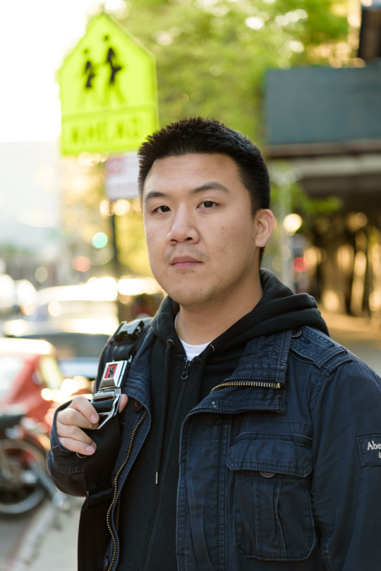
Here is an image that works pretty well in color.
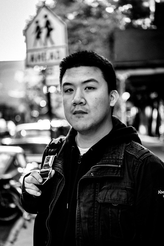
Here it is in black and white: totally different feel and it didn’t really need to be made monochrome to begin with.
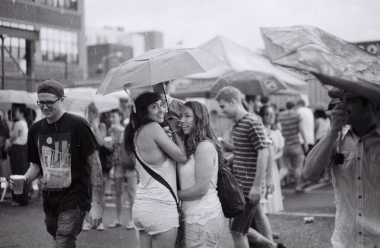
Now here are images where black and white works better:
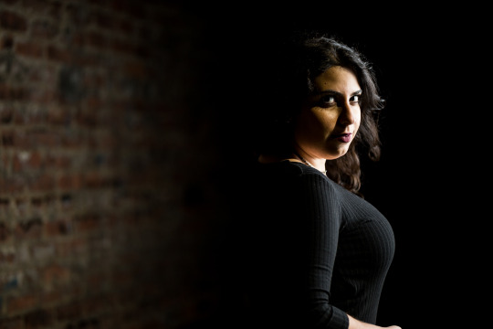
Above is color, below is monochrome:
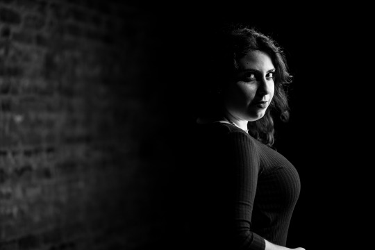
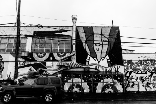
So why does it work better? I’ve generally found that images with drab color to begin with and that don’t have effective use of color benefit from eliminating the color due to the fact that it isn’t important to the scene. The portrait above is a beautiful one, but it just works better in black and white because the color isn’t important. What is important is the content of the photo.
Instead of being a crutch, black and white photography makes us look at a scene in a different way. It emphasizes subjects in a different way using contrast and different layers of it. With color, we use specific placement, tones and shades in color to make something effective. Arguably the same can be said for black and white. It doesn’t mean that it’s a crutch, it just may mean that because of what’s capable with current color technology it just may not work. Beyond that, the colors may be poor to begin with and may not be an effective part of the photo.