How Do Leading Lines Work in Black and White Photography? (Premium)
Leading lines: they’re one of the first things that every photographer learns about when it comes to shooting images in school. If you learned online and without format training, then you probably studied the rule of thirds first. But when you’re looking at a photo, one of the best ways ro artfully create an image that photographers have traditionally been taught is by using leading lines. Call it a rule that needs to be broken, it’s still a very effective one that when done correctly, can trump pretty much any other rule out there with the exception of using text in an image. For many years, black and white photography was the way to go. But when color came around, things changed quite a bit. So let’s explore leading lines and black and white photography.
What are Leading Lines?
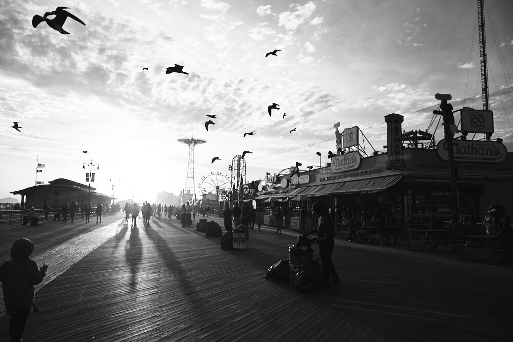
First and foremost, what are leading lines? Well, let’s look at the image above. The main lines in the image are:
- The shadows of the people on the boardwalk
- The people casting shadows
- The horizon that goes inwards to the people
- The lines and patterns that the birds are making
Why are these leading lines? Well, it’s because those are the areas that are leading a person’s eye around a scene. That’s more or less what leading lines do. Leading lines in photography find a way to take the viewer’s eye and direct it to exactly what the photographer wants someone to look at. Some photographers think about this later on while others are on point and look at it as it happens. Typically, the latter requires a specific creative vision but it can also just come with an understanding of how light works.
Leading lines can be used in conjunction with other compositional methods like working with the rule of thirds for example. They’re an inherent part of geometry–which is what Henri-Cartier Bresson worked with and that a number of other photographers work with every day. And in order to make the most effective, there needs to be a whole lot of contrast. But we’ll get into that deeper later on. As a preface, these days the movement of urban geometry and cityscape photographers tend to work the most with leading lines. They work just fine during the day, but arguably when they tend to come out the most is during the night. At nighttime, there tends to be a whole lot more contrast.
Understanding When Leading Lines are Most Effective
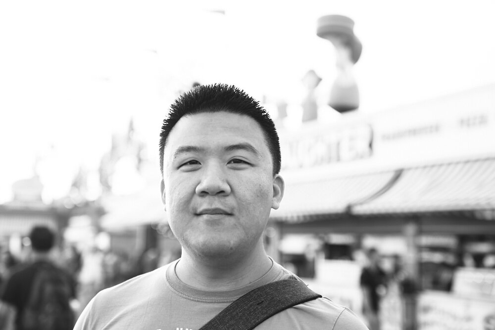
Now, let’s get something straight here: not every image will have leading lines per se. But you can find them in an image through cropping, editing, or even composing in a specific way. The old school photography minded folks out there will think that the image above is absolutely horrible due to the leading line that it cutting the man’s head off. This is why photographers use techniques such as depth of field and decluttering their background. Of course that works when you’re not being candid and quick, but you’d otherwise need to take your time and search for a background that isn’t visually distracting. The old school mentality would call this image a technical failure even though new school techniques would find it acceptable.
This is a problem that can be pretty easily fixed in post-production. The long way of doing this is by creating a mask and lightening up that entire area. But that becomes too tedious and not always fun.
In the example above, I simply created a gradient from the side going into the center and lightened the entire right side of the photo. It still looks pretty natural and the line doesn’t have as big of an effect now because it’s not extending out into the very end of the image. In this case, the leading line effectively worked against us but it can be negated pretty easily if you’re just careful. This satisfies both schools of thought.
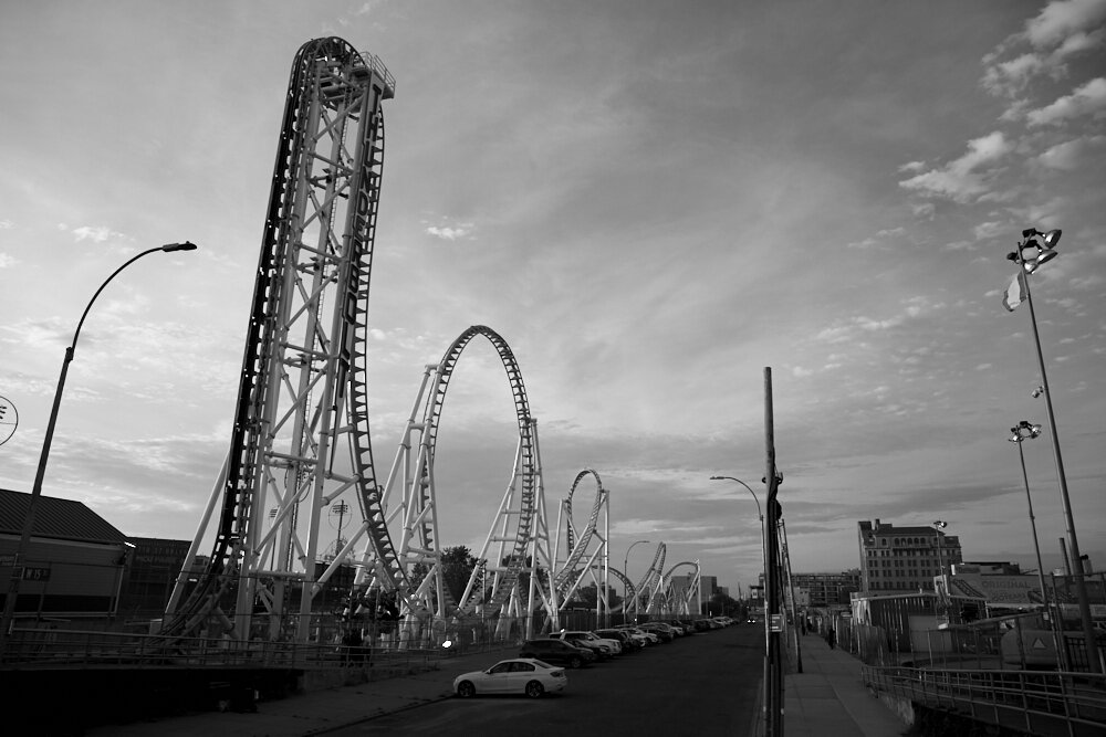
Leading lines can also work really well when they’re not there simply because the human eye is designed to look at something and make sense of it. The example above with the roller coaster showcases that pretty well. It goes from tallest, to slightly shorter, to even shorter. It’s using the horizon to make your eye create a sort of triangle.
In Color vs Black and White: The Contrast
Believe it or not, black and white works significantly different when it comes to creating leading lines and working with them vs color. With color, you’ve got various shades of the ROYGBIV spectrum and colors can be used subtly to differentiate one subject from the other. Photographers have been using this technique for years. Here are a few examples:
- Steve McCurry’s portraits
- Landscape photography
- Pretty much almost all of drone photography
Color is more or less easy to work with, but black and white is…well, different. Where color relies on luminance/saturation of colors, black and white photography relies on their tonality more so when it comes to working with leading lines. 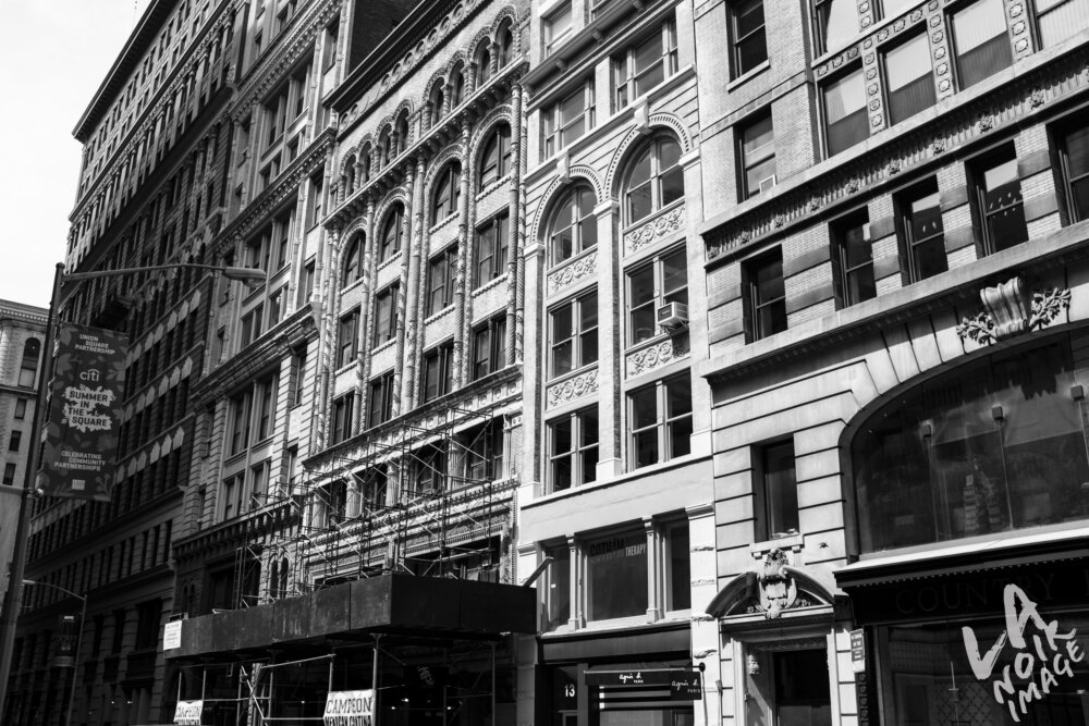
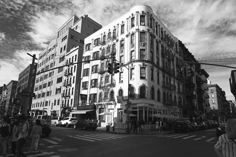
I want you to take a look at this example above. Can you guess which building was a shade of green? If you’re guessing the one all the way at the end, you’d be wrong. Instead instead the building with scaffolding on it. That building was a light shade of green but because of how light that shade is, it tends to blend in with in the white buildings on the right side of the frame. The buildings on the left were more greyish. However, just by looking at this image in black and white, you couldn’t tell.
So how do you use that effectively when it comes to leading lines? For starters, ensure that there is a high degree of contrast in the scene. Then ask yourself these questions:
- What colors are in the scene?
- Are each of these colors bright or dark?
- What is the ratio of bright to dark colors in the scene?
- Do these colors contrast a whole lot if you were to make them monochrome? Further, are there enough bright colors next to dark colors that create contrast and layers?
- Do those tones end up leading our eyes around the scene in a specific way? How?
- Is the scene distracting?
- Should I step forward or move back?
Let’s start out with these.

