
How White Balance Effects Editing a Black and White Photo
The Theory
If you’ve ever seen the movie Blade Runner, consider how many of the scenes in the cities would have looked if the scenes were lit warmer. It would have surely given off a significantly different feel but that would also mean that the entire color scheme would be completely different. I face this all the time when I’m reviewing cameras and lenses and if you want to experience it for yourself, I suggest going out during the golden hour and the blue hour and shooting photos. Try auto white balance, Tungsten at 3200K, and Daylight at 5600K white balances. What you’ll find it that the scenes will all look much different. The sky, man made lights, the sun, etc will all be dramatically different. For starters, Tungsten white balance tends to make images more blue while daylight tends to make them warmer. Need more proof of this? Go into a bar at night or any place lit with candles. Shoot at both white balances and you’ll see a pretty major difference. That difference will convert itself over via color editing.
Now let’s go deeper:
- Daylight white balance will make a scene warmer. So all the warmer colors will tend to blend into one another
- Tungsten white balance will make a scene cooler, so the cooler toned colors will blend into one another
- This affects a variety of things such as skin tones, overall feel of the image, and most of all the color channels.
Let’s take a closer look at this now.
The Images in Color

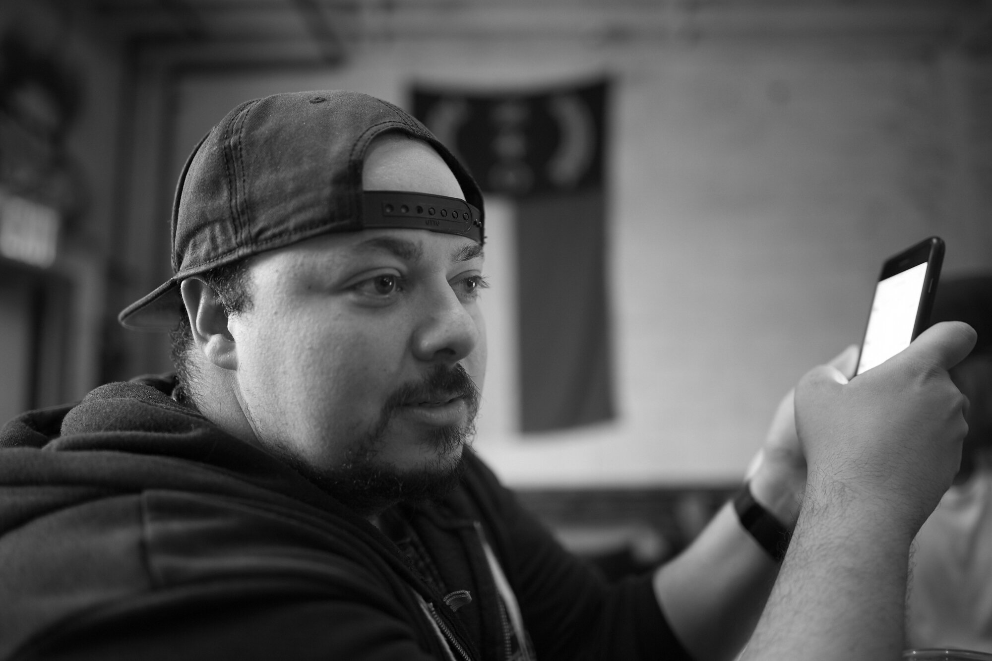
This is the scene that we’re going to study right now. There are three main light sources: the natural window lighting coming from behind Mike camera left, the tungsten lighting behind me giving off the warmer look and the iPhone. Mike has lighter toned skin and so in this scene and with this white balance the entire scene seems sort of normal to how we would see the scene in real life. Those look like natural skin tones. The background all looks natural. It seems about right.
Now answer these questions:
- What colors are most prevalent in the scene?
- Who or what is the main subject of the photo?
- What colors are prevalent on the main subject?
- What colors are prevalent in the rest of the scene and that differ from the subject?
- Do the colors tend to bleed into one another?
Answer those, and you’ll see a lot of similarities. For the record, this white balance is 5600k daylight.

Now this scene is 3200k tungsten. As you can clearly see, the entire scene changes here. Answer the same questions as above. This scene has a much greater presence of blues and purples due to the white balance.
The Conversions
Here’s the top image at 5600K white balance converted to black and white in Capture One.

Here’s the image at 3200 converted to black and white in Capture One.
The Edits

5600K Edited
Here I was able to create a low contrast image simply because red tends to dominate the entire scene. Mike has very red undertones and his skin is associated with Orange, Red and Yellow channels in Capture One. Lightroom would do the same thing.
5600K Edited: Skin tones affected by Red and Yellow
Try to work with those color channels and you’ll be affecting the entire scene. No good.

3200K Edited for Skin Tones
But try it in Tungsten and you’ll find that the scene is much easier to work with. You’ll get a much more pleasing black and white image where you can have a ton of clear separation of his skin tones and the rest of the scene. That makes Mike stand out from the scene more. We haven’t even gotten into editing for Contrast, brightness, etc. But those can also surely be taken into account. However, you don’t need to because those are much more globalized adjustments and can often lead to very destructive editing of a photo. Working with color channels though does that much less so.