Joel Tjintjelaar: Defining a Unique Creative Vision with Urban Geometry (Premium Interview)
All images by . Used with permission.
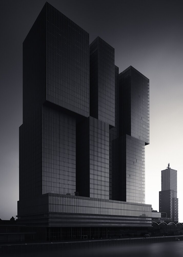
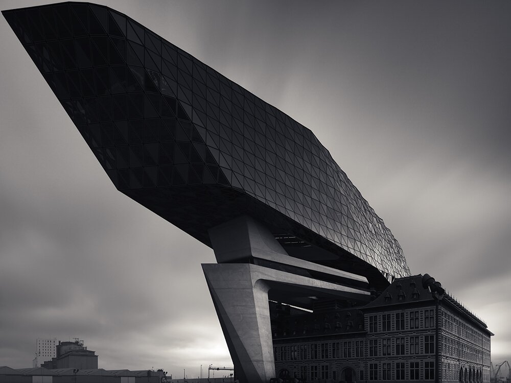
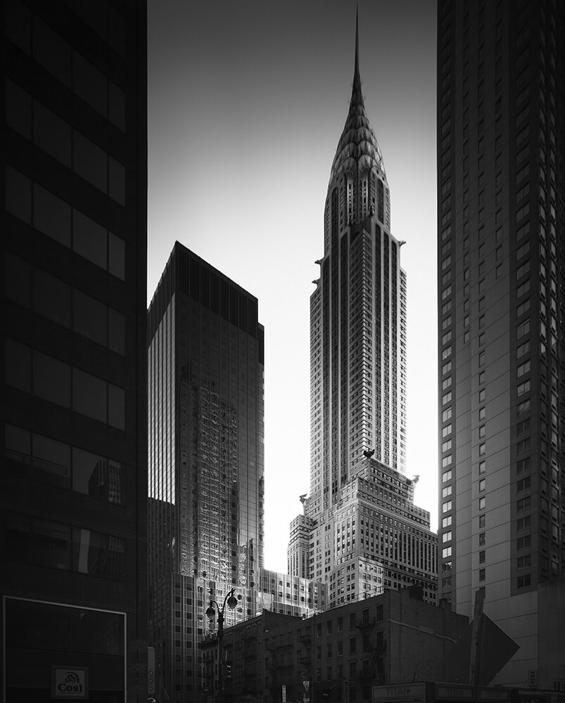
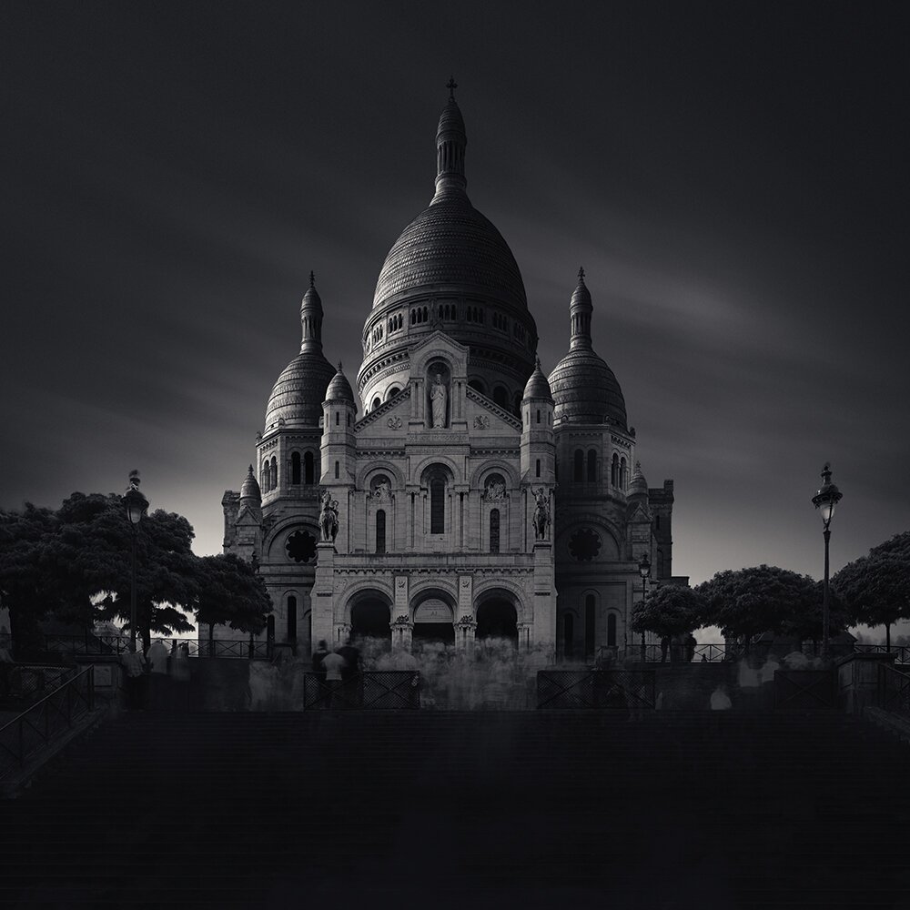
Urban Geometry is a field dominated on Instagram by a lot of photographers who have only really come up in the past few years and hacked hashtags. But when you compare their work to a master like Joel Tjintjelaar, there’s a clear distinction in how he’s refined himself as an artist over time. Joel is first and foremost a black and white photographer who works very closely with Phase One. A glance at his work immediately transports you to a completely different world with a very atmospheric sense of time and place standing still. His works is clean but at the same time doesn’t look seriously tailored or like he went a bit too happy with the clarity slider in Lightroom.
But most of all, he’s a real artist.
So obviously, folks love architecture and the proliferation of cell phones have made more and more people get into street photography. Then in the past few years, Urban Geometry has really started to take off as a special blend between the two and with an evolution on Bresson’s ideas of geometric fine art shapes in a scene. So what to do you think makes people so enamored with Urban Geometry and black and white? What have you heard from clients and buyers?
Let me try to first answer why I think people are so enamored with black and white in an urban scene. In a I already mentioned that the perception of depth takes place in the color blind part of the brain and is therefore dictated by the difference in luminance values. Geometrical shapes in particular, benefit of the added depth in a photo. They start to come alive in black and white. The answer to the other part of the question, why Urban Geometry, is a long shot. I’m guessing cities, urban areas and its architecture, have always fascinated people. It’s surely a motif worth photographing due to its aesthetics. And when a specific group of photographers, among which yours truly was a part of, found a way to approach it in a symbolic and dramatic way in black and white, it had a certain appeal to other photographers and they started to pick it up too. Geometrical shapes are simply very aesthetic. And that’s always an advantage in fine art.
You’ve been shooting for years now, so how do you think your processing and work has evolved when it comes to Urban Geometry?
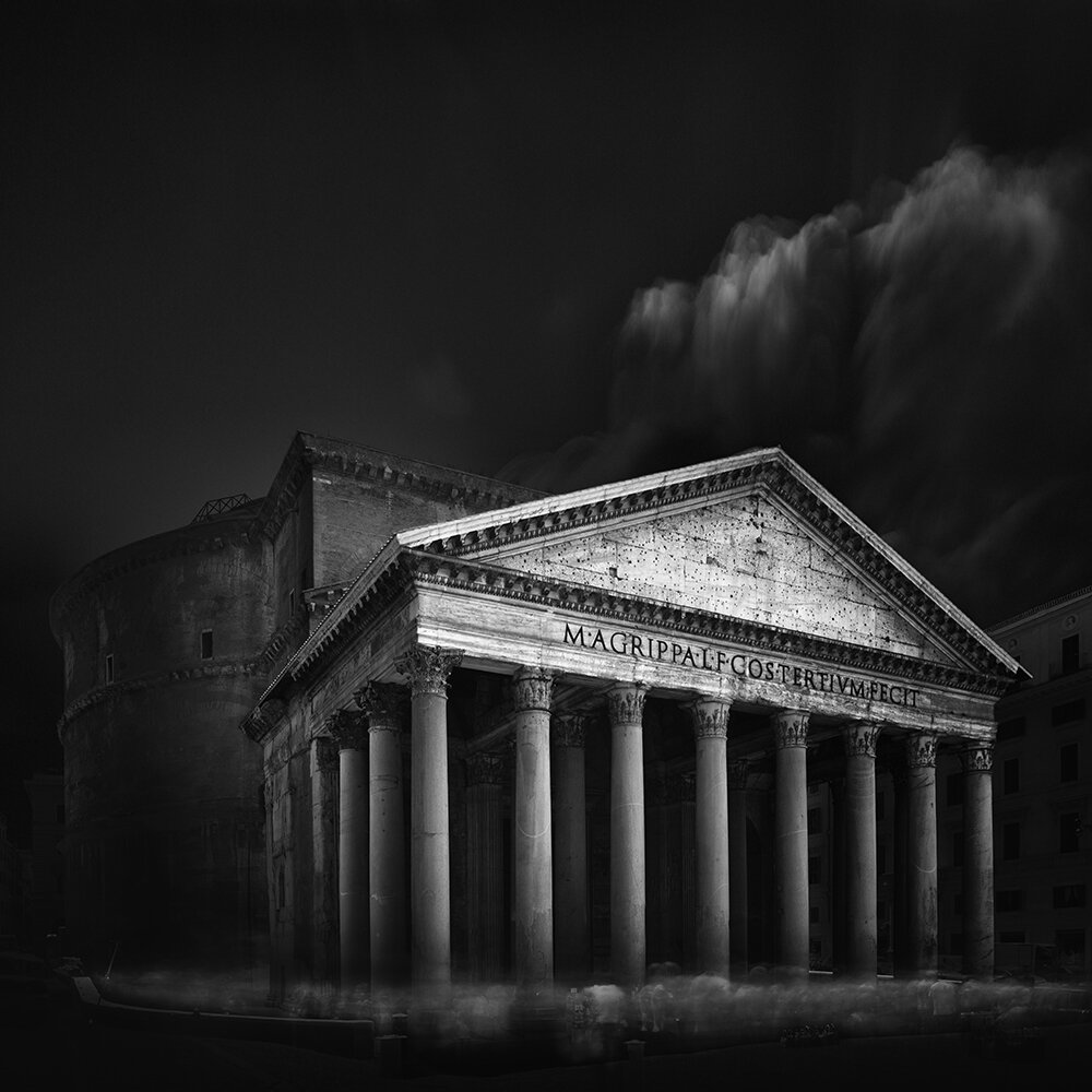
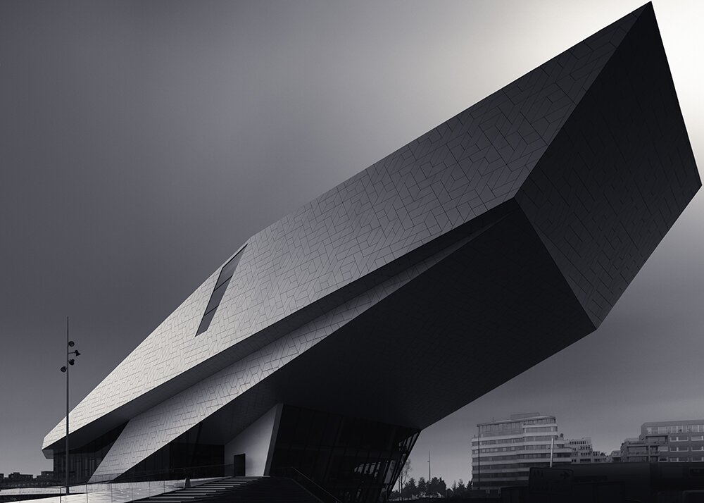
There has been a recurring theme in my work over the years. I started in a rather subtle way, in terms of processing, but in a more dramatic way, capturing it. My preference when I started was not to go the traditional way, as commercial architectural photographers would capture it, but to point the camera to the sky and create drama with the converging lines. Then I went the more technical and traditional way, with the camera pointed straight forward and always maintaining the straight horizontals and verticals through the use of tilt-shift lenses. The processing became less subtle and quite dark and dramatic, as if I wanted to compensate for the ‘conservative look’. Now I’m back to more subtle processing, still shooting in the traditional and technical way, but the difference now is that I go as close as possible, to distort the perspective as much as possible, but still maintaining the straight lines. Recurring theme throughout the years has been the distortion. Distortion is considered to be more aesthetic, as some neuroscientists have tried to point out in the field of neuro-aesthetics.
How do you feel doing this type of work with the new Apochromatic back is different from what you’ve done before? I’m sure the process is similar though, correct?
The process Is similar but now obviously, with the achromatic back you don’t need to convert the images to black and white anymore. And, perhaps funny, you feel you have the obligation to let every shot count. So my process is slowed down even more.
“Distortion is considered to be more aesthetic, as some neuroscientists have tried to point out in the field of neuro-aesthetics.”
I think that a lot of folks typically go about creating Urban Geometry by simply converting to black and white, boosting clarity, deepening blacks and pushing whites in an effort to create more contrast. But at the same time, some people just mess around, and that’s fine. With you personally, how did you go about shooting scenes and coming out with a specific creative vision that you were intent on getting? Did it involve research and hours of trial and error?
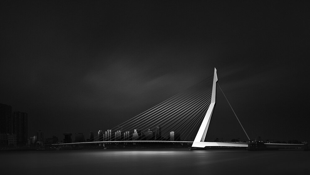
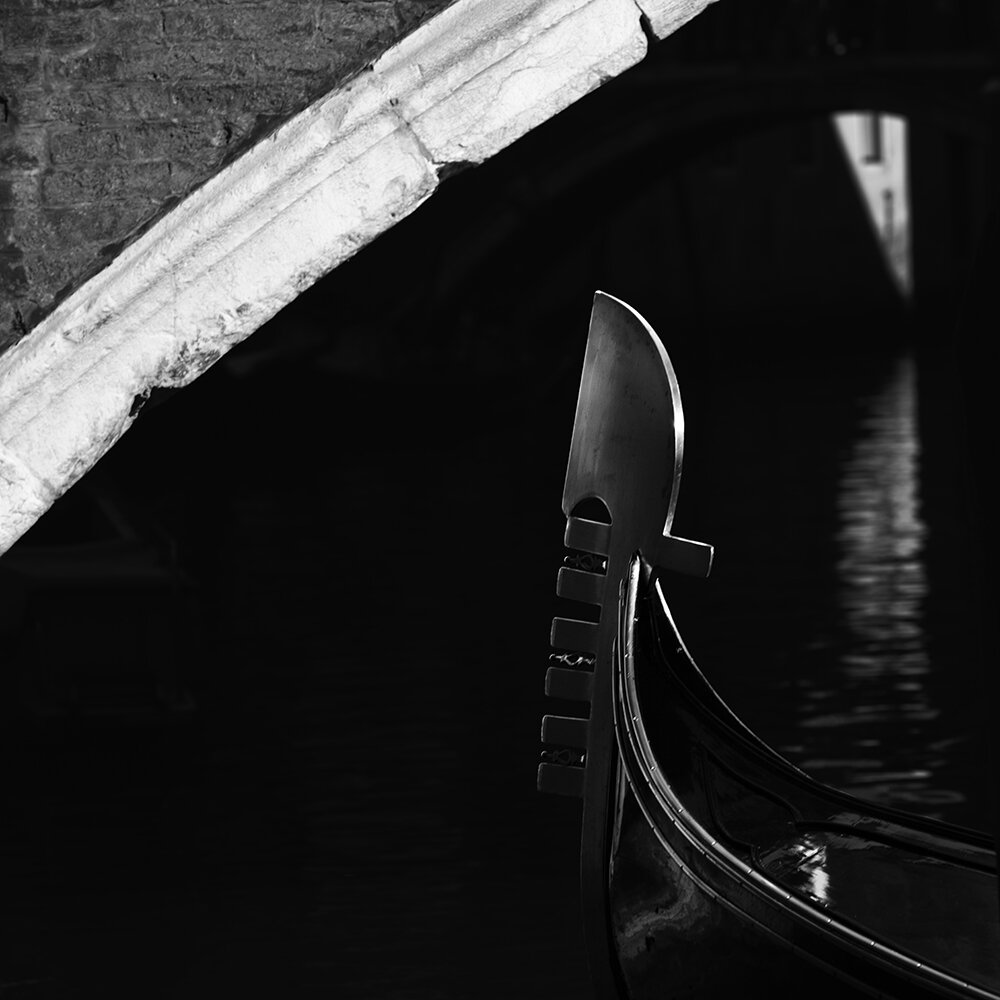
I have a thing for still life photography: you can control everything from the composition up to the way the light should hit a surface. There’s this sense of intimacy and otherworldliness that you don’t see that easily in other genres. And looking at still life paintings, objects seem to emerge out of the darkness. That was something I liked to emulate in my still life work: something emerging from the void. Since shooting a still life takes place in an environment that can be controlled, it doesn’t take much processing. What I had in mind is usually almost exactly what I get. That’s very different with Urban Geometry. You can’t control the light in the same way as in a still life. So you do what you can do in-camera and the rest, the way light and shadows should behave, will be done in processing. That was a creative vision that I had and wasn’t the result of trial and error. The processing part however, was research and trial and error. But you know how it goes: if you have something in your head, you will always find a way to achieve it. I found one that worked, but not only that, I also tried to find a structured way of approaching black and white processing that can easily be transferred to other people. A method that makes sense and that’s not just a toolbox of opportunistic, autonomous tricks that led to a specific result. This way it’s easier to teach it and also to improve on it.
Now, you’ve written about a defense of black and white photography. Obviously, there are folks out there who think it amateur, but I feel that Black and White photography surely does have its own place in today’s society, especially when it comes to prints. Do you think that today’s world of printing less has anything to do with this?
It’s a fact that printing isn’t the norm anymore in today’s digital world. The default is a jpg image on social media. But a jpg image doesn’t come close to how a good print can look like. And especially one in black and white. There’s a certain quietness and introversion to a black and white print hanging on a wall. It’s as if it doesn’t ask for attention. It’s more intimate. Perhaps people in general don’t understand why someone should work in black and white when there’s something more real and more in line with our technological era, with working in color. But I don’t think it has anything to do with printing less.
How do you feel artistic photography is going to evolve within the next 5 years?
I think technology will keep evolving and we will have more megapixels, obviously. But I don’t think that will change artistic photography, perhaps we’ll get to see better artistic prints in larger sizes. How it’s going to evolve in terms of visual styles, genres or artistic intention? I feel we will continue to see black and white, perhaps even more, and I believe that the quality across all genres will improve. Why do I think that? I’ve seen myself in the past 5 years how much the quality and quantity of online articles and tutorials and real life workshops have increased. And I see more people doing something that just 5 years ago only a small group of people could create. Technically there’s a visible progress, and that will only increase in the next 5 years. And that also means that we might see more artistic progress.
What do you feel is more important: networking or having a damned good portfolio? Why?
A damned good portfolio is paramount! And you need to be able to connect with people too. I’ve seen too many fantastic photographers that no one ever heard of. Simply because they prefer to do their thing and don’t care about networking. Which is fine with me. But if you want to make a name and a living with photography then you first need a good portfolio and then use social networks in a smart way.
What are some of the biggest lessons that you’ve learned as a photographer in the past five years?
Never be complacent, no matter how much success you’ve had with your work. The danger is that you’re creating clichés of your own work and style. Another important lesson is that emotion and meaning are very important in photography but without aesthetics it doesn’t have any impact.
Where do you see yourself in one year as a photographer? How are you as an artist evolving?
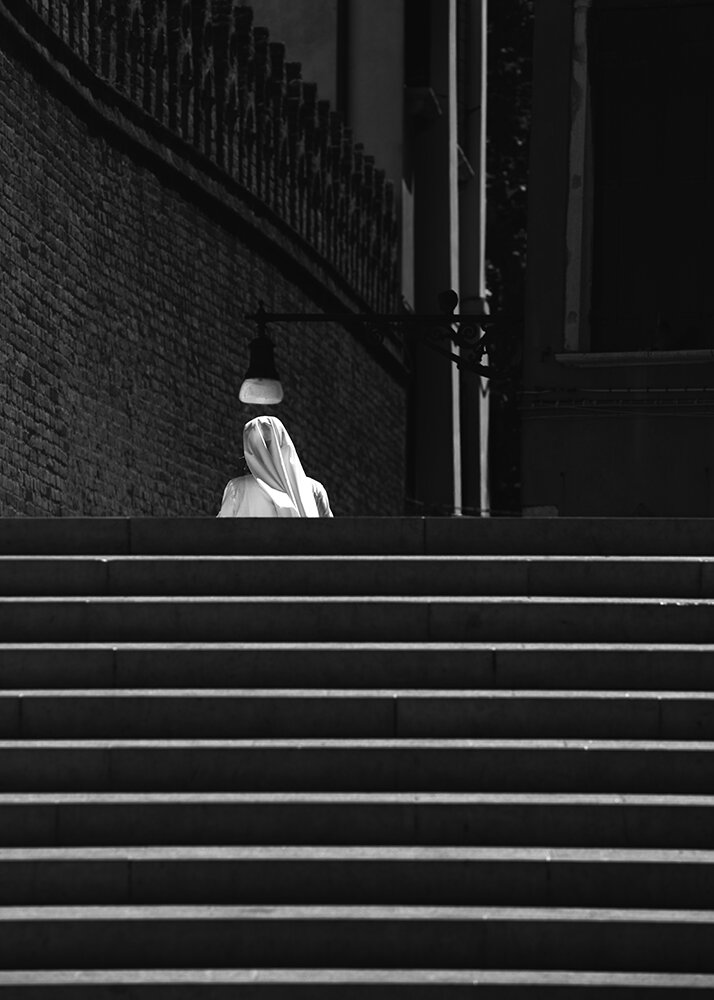
Shooting more portraits, more street and still life. Putting more meaning and emotion in a photo. Specifically more street, but that’s the most demanding genre in photography. But I’m also trying to make still life more interesting for the viewer. It’s always considered a less spectacular genre: it’s the depiction of something trivial and unimportant, without any story, that is negated by a world that prefers to glorify the exceptional, the extraordinary and the beautiful. Not the non-exceptional. It’s an underrated genre. I’ll try doing that by educational articles on my website that will hopefully entice the reader to try more still life. And of course by creating beautiful still life photos myself. But overall I think sharing knowledge, supported with good photography, is more important to me than trying to be a more accomplished artist in a forced way. I believe that if you do that, you’re educating yourself and you’re evolving as an artist in an organic way, at the same time.
