Report: Using Ilford Pan F Plus 50 with the New Sigma 14mm f1.8 Art Lens (Premium)
I like to equate my experience of film photography to that of the experience that the older generation of photographers who experienced digital for the first time. At 30 years old, I still haven’t had the opportunity or the time or step into the darkroom. I never had the opportunity to do it either in college or high school. So to continue with the evolution of film and how it can deliver pleasing images, I believe that using newer, sharper lenses designed with digital sensors in mind is a great way to get even more out of film. Ilford Pan F Plus is arguably the sharpest black and white film out there with TMax and Acros being a bit behind, but if it was sharp even in the days before all of these fantastic new lenses started coming out, then when using these new lenses the film should arguably be even better. At least, this was my thinking when I loaded a roll of Ilford Pan F Plus 50 into my Canon EOS 33 and slapped the brand new Sigma 14mm f1.8 Art lens on the camera.
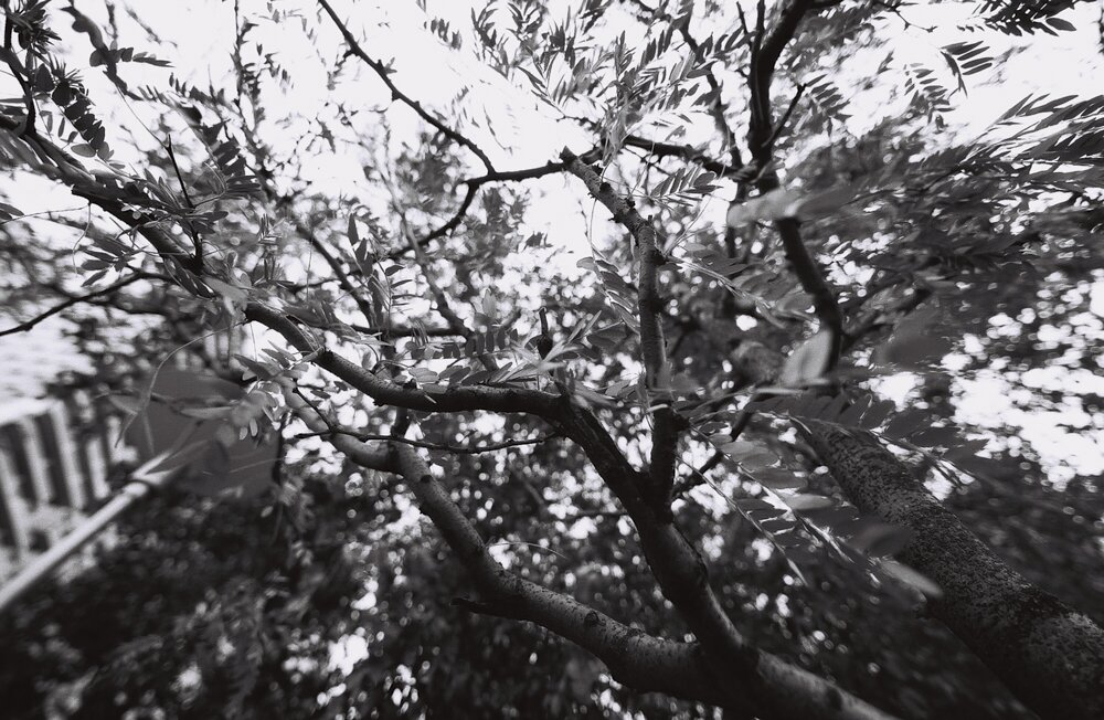
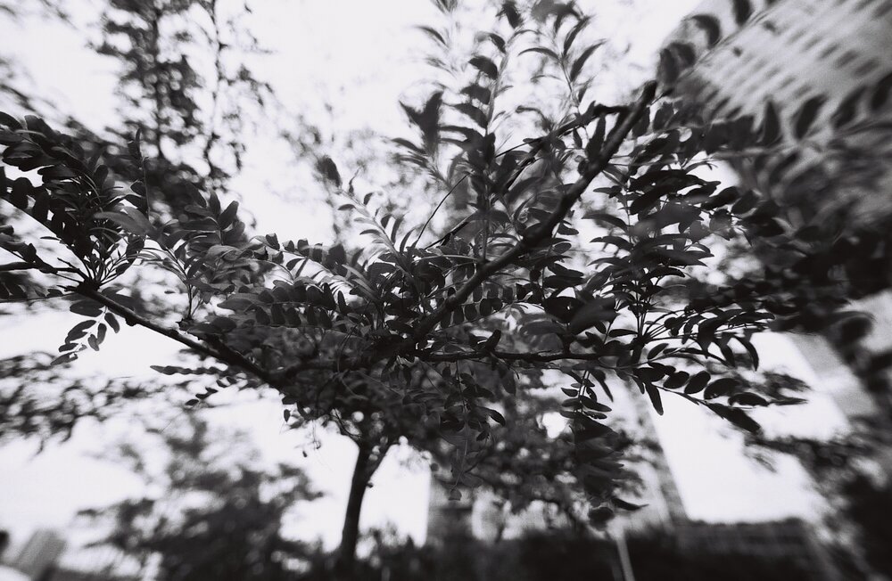
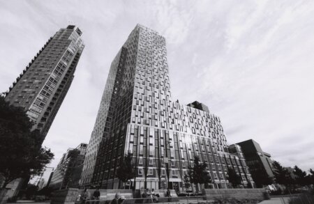
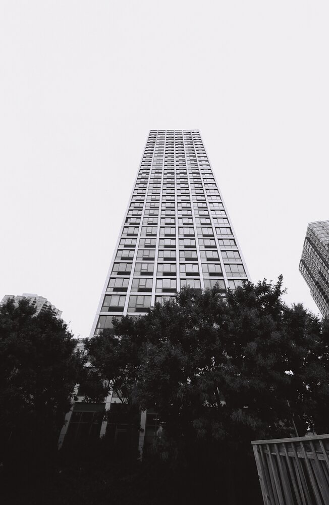
Sigma’s new lens is designed for astrophotography, but that doesn’t at all mean that you can’t use it for a number of other things. Interiors, landscapes, cityscapes, architecture, and believe it or not, even photos with some bokeh in them all came to mind when using this lens. Besides, Sigma’s lenses since the Global Vision announcement have been runaway hits almost consistently. However, using Sigma glass with film is always quite an experience. Why? Well, in the past few years Sigma has been doing this thing that ultimately increases the contrast of the images that you get. I noticed it first with the company’s 50mm f1.4 original and in comparison to the company’s 50mm f1.4 Art lens. Then when I looked at the rendering from the Sigma 35mm f1.4 Art compared to that of Canon’s and Zeiss’s I found a lot more contrast. Lots of photographers love this contrasty look and understand that digital sensors can do quite a bit to get more details from the images. But with film, that’s a bit tougher unless you’re making a print, of course.
So why use Ilford Pan F Plus 50? I like to think of this film as the black and white version of Fujifilm Velvia 50. Even in today’s photographic world where digital photography gives you so many endless possibilities, Velvia is capable of doing things that make any photographer’s jaws drop. Fujifilm Velvia 50 is a chrome film and that means that you’re going to get some absolutely stellar colors but at the risk of a more limited dynamic range. Ilford Pan F Plus 50 has quite a range of tonality though. However, the process of working with a film like this is similar. The mentality of the modern film photographer is that of wanting to get everything that you possibly can perfectly right in camera because you don’t want to spend time dodging and burning or working with the images in post. There are indeed photographers out there who try to get the most from their scans and then edit in post; but in my opinion I feel like digital is superior when it comes to doing things like this. So Ilford Pan F Plus 50 film is a very nice challenge. It’s essentially a black and white chrome film.
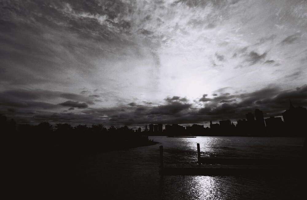
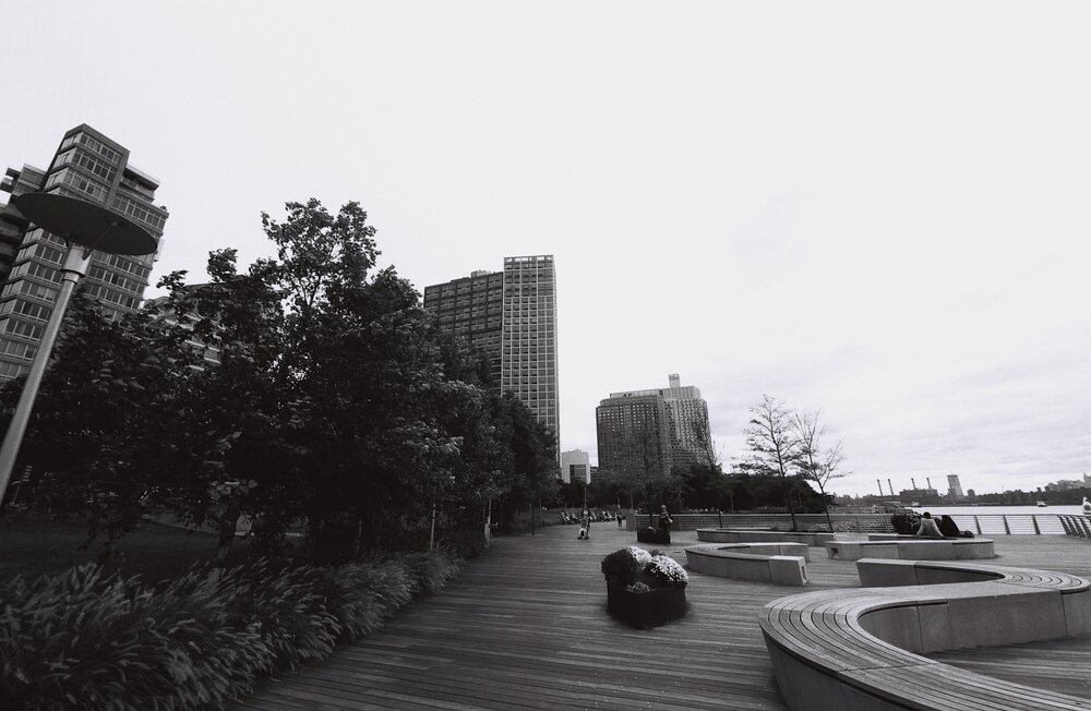
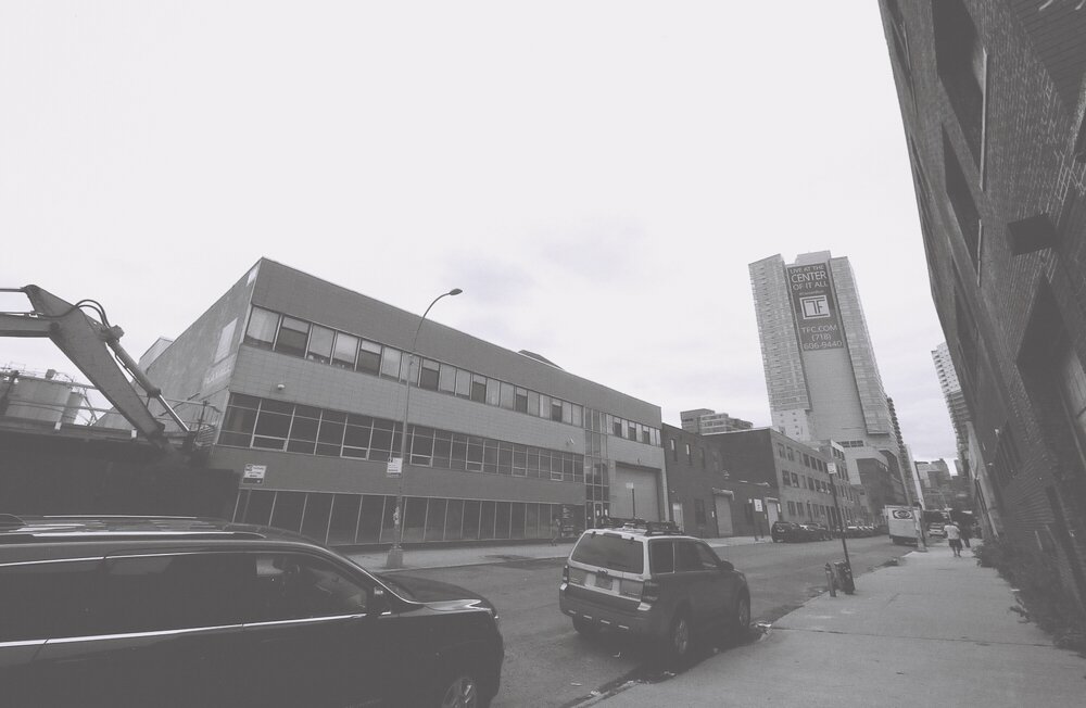
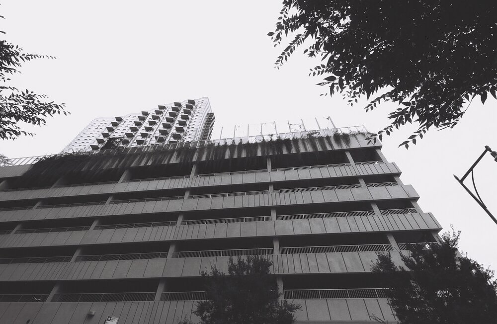
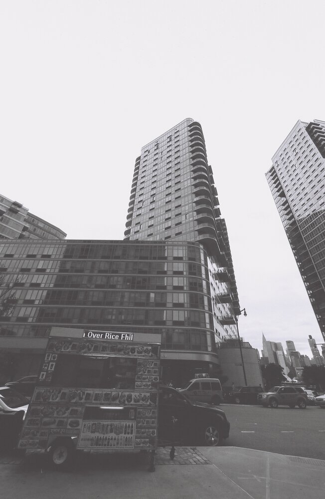
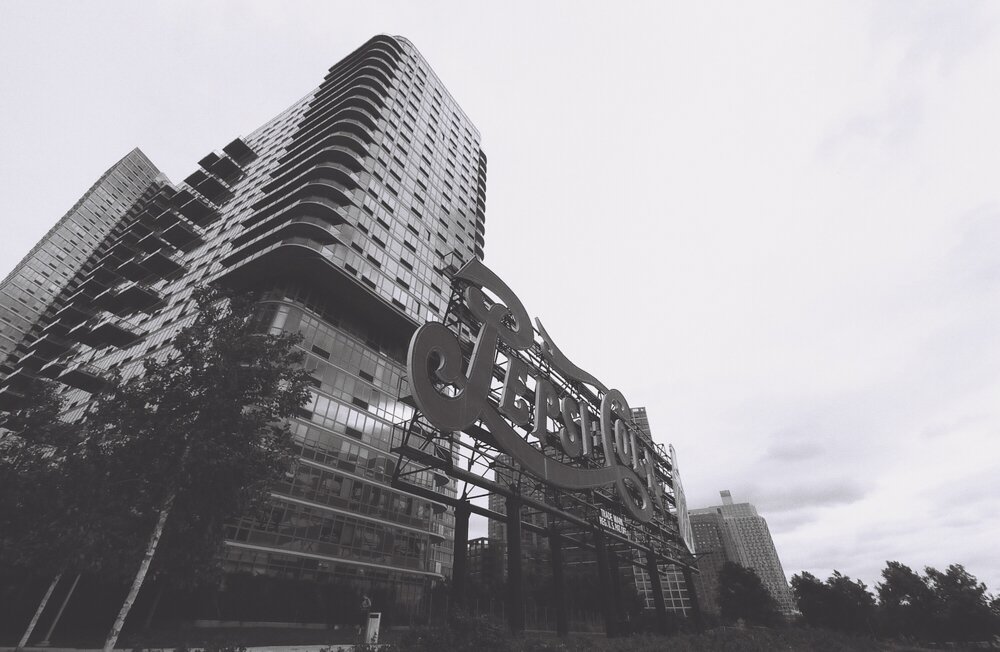
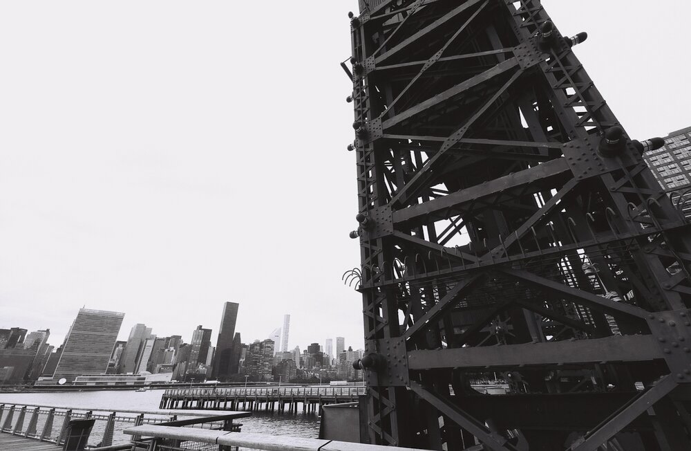
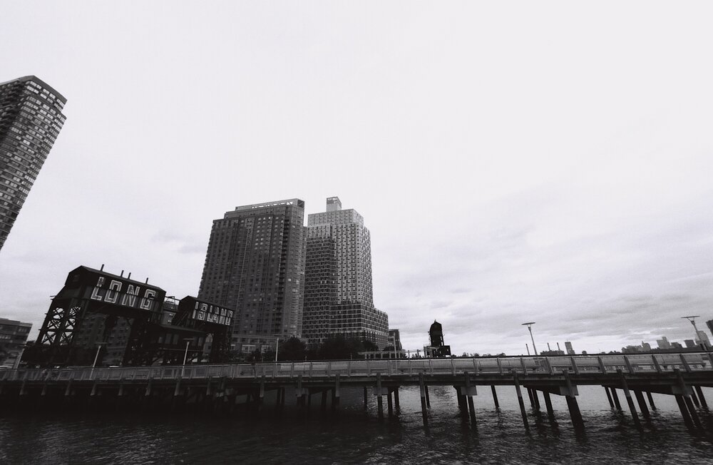
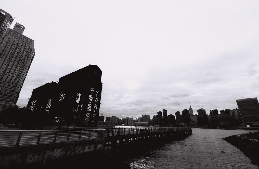
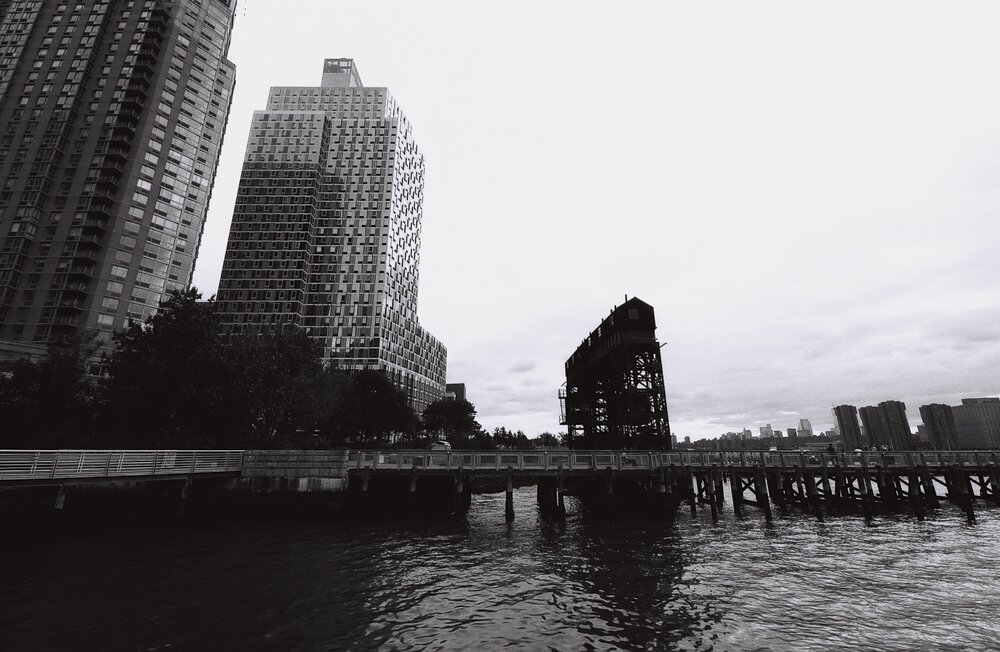
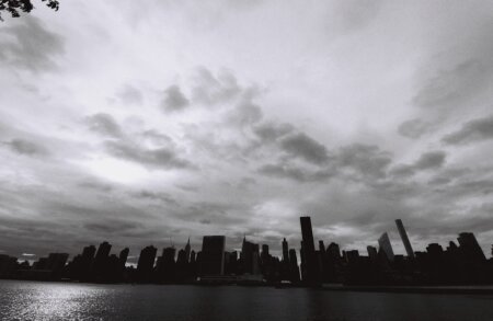
For this test I decided to walk through New York’s Long Island City. LIC, as it’s affectionately known as, has held a place in my heart simply because it’s in the borough of my birth, Queens. Despite going through some massive changes, it holds an identity that makes it inherently still in some way or another the Queens that I grew up knowing. The LIC waterfront is home to tons of expensive apartments, beautiful architecture, views of Manhattan, the East River, and lots of complicated geometry that lends itself well to the black and white photography world. My scans, which were graciously developed by Lomography and then scanned by me at home, proved to me that this film can be absolutely spectacular but can benefit from using ND filters to get the most from the scenes. Unfortunately, the Sigma lens doesn’t lens itself well to using ND filters. The Sigma 14mm f1.8 has the lens hood permanently attached and the lens cap simply goes over the hood.
So when I went about working with Ilford Pan F Plus 50, I tended to underexpose the scenes simply because of a few methods that I’ve done with black and white photography in the past few years. Photographer Moose Peterson taught me that if you make the black levels in an image deeper, then they fool the eye into thinking that the image is sharper than it really is. Of course, this is already a black and white film. The intended result here was to play with silhouettes and backlighting of the city in a visually pleasing way.
What I really like about this film is how it handles midtones. When you look at the images from it, it’s almost as if you took a digital image, threw it into Lightroom and turned the Clarity up. But the clarity isn’t to the level where you’re obviously getting halos or anything inherently weird. Instead, I like to call it a crispness. Part of this also inherently comes from the super sharp Sigma glass, but ISO 50 film is also a big part.
Certain films from Ilford I feel have a cinematic look to this. But Ilford Pan F Plus I feel has a slightly digital look to it partially due to how much detail comes from the midtones. The only other film that I’ve seen pull midtone detail like this is Kodak Tri-X. So with that said, it’s difficult to get a cinematic look to the images that is so highly prized these days. Instead, the images look like, well, really well manicured photos without a whole lot of work. To any busy photographer, that is a godsend.
Ilford Pan F Plus is a beautiful film overall. At the time of my writing this post, I had just gotten off the phone with famous photographer Ellis Vener. It’s his favorite. Is it mine? Not for the way that I shoot. But I still can’t deny how great it is in the hands of a skilled photographer. If I were shooting portraits with this film, I think that my story would be much different.