Why and How Too Much Contrast Can Kill a Portrait (Free One)
How Contrast Works
We’ve explained in a previous post how contrast will work by increasing the differences between the brightest brights and the darkest darks. That works very well with HDR images–otherwise known as high dynamic range images. But honestly, when was the last time that you saw a good HDR portrait? Probably never. And I’d really recommend that no one does it. Contrast, when it comes to portraiture works in a specific way that adds a type of artificial sharpening to the portrait that can make skin look pretty terrible. Let’s explore.
How it Works in Black and White
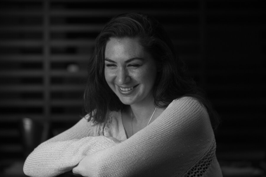
Our lead image for this story is a straight convert to black and white and uses 5600K Daylight as the white balance. This makes the skin tones warmer but also sort of blends the scene into the background. It would be nice to get more details out of her but kill the background a bit more. So how do we do that? Can we increase the contrast?

Here’s what happens when we increase the contrast? No. Seriously. No. Look at what it’s going to her skin and look at what it’s doing to the sweater. It killed the details in the background, but at what risk? Let’s try something else.

In this scene we lowered the contrast, added a vignette and lowered the exposure. It seems a bit closer to the original image.

Finally, here’s what happens when you go ahead and manipulate the color channel that is closest to her skin tone. You get a bit more of those nice, flattering highlights while also making her skin look smoother and not losing details.
Moral of the story: high contrast portraiture doesn’t always make sense.