
Mastering the Art of Black and White Urban Geometry Photography (Premium)
The Science Behind Geometry
Since we began being a species, human beings have tried to find a way to organize and make sense of the environment around them. This natural predisposition lends itself well to geometry. Henri Cartier-Bresson stated that he was an artist that found a way to look at geometric shapes in the world and capture them in an appealing way. Urban Geometry is the modern evolution of that idea and it has only progressed so fast as of recent due to the internet and the simple ability for people to upload and share photos at a moment’s notice. That’s part of what makes Urban Geometry so appealing–the fact that it uses shapes, tones, lighting, and the frame to lead the eye around in a way that it simple to digest.
Seeing the world in the form of shapes is pretty simple to begin with. Just look at the everyday objects around you: brick walls, shelving units, floors, etc. Then move into the very minute details of it all by looking for abstracts.

For example the photo above could have easily been thought of to be an area around a parking lot or a grate of some sort. It’s actually the exterior part of an air purifier. But there are things that work for it such as the stark contrast between the brights and darks combined with the darkness to the light.
When shooting, you’ll eventually learn how to see the world in different tones, but more on that will come later.
Geometric shapes, such as the example shown off earlier in this section, and your ability to see them will eventually come to you as you go around the world looking for them. In fact, I strongly recommend that you go around not photographing at all. Instead, look around the world and let it all just come to you. Start out in a big city with big buildings. You’ll eventually get that feeling of “I wish I had my camera with me.”
“For me the camera is a sketch book, an instrument of intuition and spontaneity, the master of the instant which, in visual terms, questions and decides simultaneously. In order to “give a meaning” to the world, one has to feel oneself involved in what one frames through the viewfinder. This attitude requires concentration, a discipline of the mind, sensitivity, and a sense of geometry.”
― Henri Cartier-Bresson
Making it Work Within Your Format (4:3, 3:2, 16:9)

Besides just seeing the world in terms of geometric shapes, you’ll also need to figure out a way to frame it all. Most cameras work within the 4:3 or 3:2 formats, but your mind probably doesn’t see or think that way. Maybe you think square! As a tutorial example, take a look at how the photo above takes the buildings and finds a way to make them look seamlessly meshing together.
Now imagine if that were focusing into a more defined area.

Now here’s what a square crop of that idea looks like. It’s interesting in that it adheres to what the photographer is trying to accomplish but it also is focusing in on a more minute detail. This harkens back to the idea of finding the abstracts around you in everyday life. This was only possible with a square crop from the original 4:3 imaging area shot. Sometimes it’s easy to find a different sort of crop within a larger frame that works.

If that’s too tight for you, then maybe a 16:9 crop can work. This crop works for the same reasons that the square did but includes more shades, tones and patterns. It looks incredibly seamless and adds more balance to the entire scene.
LOOK FOR PATTERNS

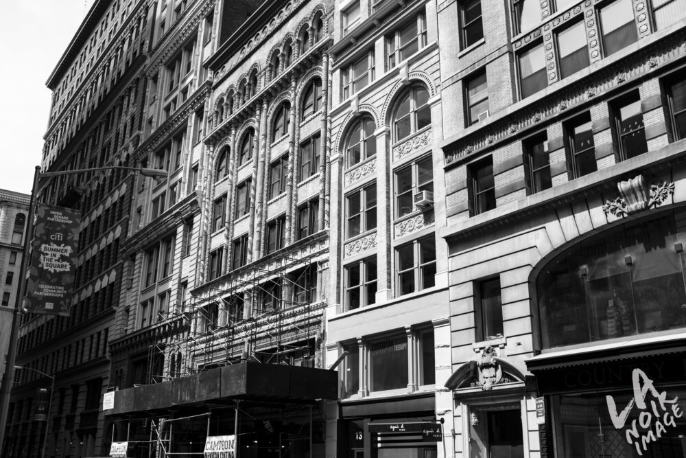
In big cities, it can be difficult to not find patterns. Consider the following: many buildings in any given neighborhood are designed to look and feel the same due to the fact that it creates a sense of uniformity in a neighborhood within a city. So with that said, it can be tough to not find patterns or similarity. Lots of pre-war apartment buildings look the same if they were targeted to one social class vs the other. By studying the individual areas and pieces of these buildings, you’re going to find patterns. Similarly, if you look at larger, all glass buildings, then you’re bound to find patterns.
Let’s take a look at an example:

When looking at the building above, one can see that there are clear patterns. Let’s identify them:
- The textures
- The tones
- The colors
- The placement and distance of the windows
Now that you’ve identified them, we can find a way to focus on a specific section of the building.

This image was created using a 16:10 crop then working with the highlights, shadows, blacks, whites, contrast and clarity. It’s far different from what you may have been looking at, but part of the magic of Urban Geometry comes out in post.
It’s all about Contrast, Light, UpRight tool and Tones

Urban geometry has a whole lot to do with the editing process. With that said, photographers should look out for the contrast, tones, and lighting. To start, consider the ROYGBIV spectrum. The theories behind the spectrum state that colors on either end clash with one another. For example, Red and Blue are on total ends of the spectrum; so in terms of color coordination they contrast a whole lot. To that end, reds and blues will clash and create contrast within a scene.
But hold on, that’s not totally true. If they’re pastel shades of red and blue, then they’re going to contrast a whole lot less because they’re both lighter in color and mixed in with white. On the other hand, a darker red will create a whole lot more contrast with a lighter blue. Here are some questions to ask yourself:
- Where is the color on the RGB Spectrum?
- Where is the main color in relation to Green?
- What is the clashing color?
- Where is the clashing color in relation to my main color?
- What shades are the main color and the clashing color? That is, how dark are they?
- Which is darker?
- Is there a stark contrast between the dark and light?
The ultimate combination is finding a clash between darks and lights. In Black and white photography, that’s what it’s all about. Otherwise, it can be very difficult to tell a light, seafoam green apart from a shade of tickle me pink.

Additionally, in Urban Geometry the Adobe Lightroom Upright tool can be very useful. It will work to make your lines and straight and geometric as possible.
Now get out there and shoot!