How Much Clarity and Sharpness is Too Much Clarity and Sharpness in Black and White Photography? (Premium)
I think we’ve all seen it: photography that follows a simple recipe. It’s in the black and white world and it goes something like this: convert to black and white > raise clarity > raise sharpness > raise contrast > export. Sometimes they’re done well, but more often than not that’s very rare. Most of the time the images look like tacky digital simulations due to people not understanding light and exactly what’s going on. All of this has its roots in the film days.
by
Before we even get into exploring how much is too much, here’s an example of the type of image that I’m talking about that’s rooted in film. This photo was shot on Kodak Tri-X and used a Red filter to get this specific look. It’s organic and it’s real. And the image has a look that grows on you. What it does is adds more contrast and darkens details to get more out of the skin tones. It’s sort of like adding clarity to a photo–which specifically goes after the midtones. Sharpening increases micro contrast in some ways while contrast increases, well contrast. Contrast is the difference between the brightest bright in the scene and the darkest darks.
With more and more photographers shooting digitally, they don’t understand the process. So let’s take a look at a number of examples here.

Black and white converted
Take a look at these portraits. These are all shot digitally and converted to black and white. They all have a specific look to them that brings out more or less details according to the actual aesthetics of the images. In this conversion, Mark looks very pleasant. We don’t see a lot of imperfections with his skin and this is all due to a natural conversion.

All the clarity and sharpness
Now here’s what happens when you boost sharpness and clarity all the way up. You see specular highlights come out that you wouldn’t see before. Look at Mark’s beard and shirt now. The patterns and threading of the shirt become very apparent and you can tell that on his beard there are some specular highlights coming off. If you didn’t know any better, you’d probably think that his beard had some grey hairs in it. But in truth, it doesn’t. Extra clarity and sharpness does this by amplifying a person’s “flaws.”

Clarity and sharpness dialed all the way back
Now when you tone it all back all the way, what you get is an image with even less details. It arguably leaves you wanting more from his face or at least the eyes. But it also leaves the image looking like an ethereal dream in some ways. It’s nice. So far, we’ve shown that when it comes to standard natural light portraiture, sometimes less can be more. Now let’s go even further and look at how lighting affects this.
Before we go deeper, I should explain to you how lighting affects an image–and by that I specifically am referencing off-camera flash. Flash has what’s called a flash duration that acts almost like a second shutter speed to stop fast moving motion. Then on top of that, it adds extra light to a scene to bring out what are called specular highlights. These are details that the camera and your eyes don’t naturally see unless you have 20/10 vision and you get super, duper up close and personal. Again, you don’t get these with natural light or constant light.

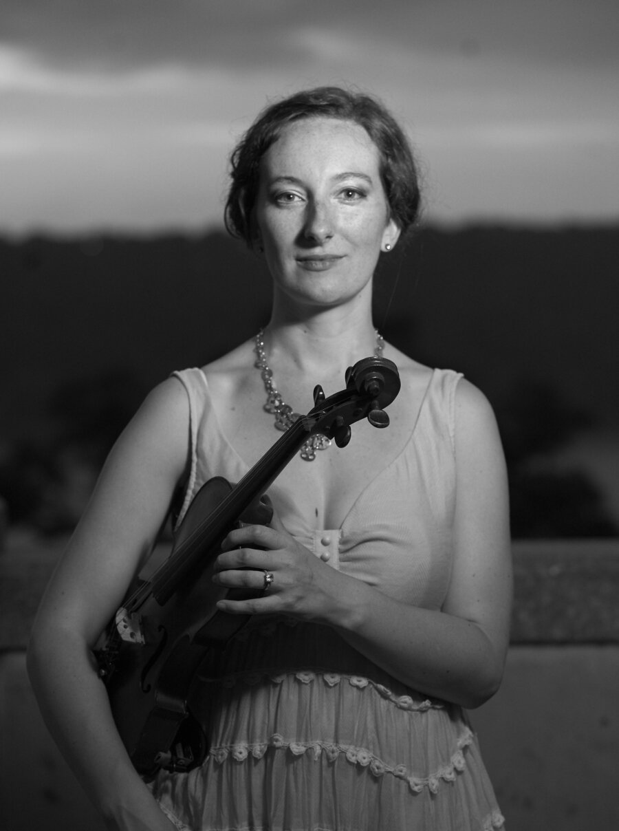
Black and White converted
Here’s another black and white straight convert. This was shot with flash and a lens that is based off of vintage optics. We’ll explore this a bit more. Jen’s eyes are sharp. In fact, her entire face is sharp–but they’re not super, duper, extremely sharp in the same way that modern lenses are designed to be.

Contrast maxed
Here’s the scene with the contrast maxed out. It’s alright, but it’s also a look that doesn’t seem so appealing.

Clarity and sharpness all the way
Here’s the scene with the contrast being standard but the sharpness and clarity are raised all the way. We see more micro details this way and as you can tell, it isn’t so bad.

Clarity raised but contrast lowered. A bit of sharpness boost.
Now here’s the scene with the clarity raised a bit, contrast lowered and a bit of sharpness added. Looks nice, right? It also seems a bit more inline with the previous image set where the images are shot in natural lighting.
When it comes to portraiture, a little less contrast, a bit of clarity and a touch of sharpness seems to be the way to go. Portrait photographers in the film world knew this for years. And in today’s digital world, it seems like we’re only now just rediscovering that.